When you go grocery shopping, what do you see?
Okay, okay, that’s not really a fair question because you probably see what sometimes feels like a million different products all competing for your attention—and your wallet. But it’s probably fair to say that when you’re perusing the aisles of your local grocery retailer, it’s the products that are packaged in interesting ways that grab your attention.
Packaging is obviously an essential part of the consumer packaged goods (CPG) industry. Not only does it keep products from spilling all over store shelves, shopping carts, and you (hopefully), it’s also a key component in customer engagement and creating loyal buyers. Simply put, says Kevin Keating, President of PKG, “Packaging design makes your brand stand out on the store shelves and online. It helps persuade customers to buy your product.”
Creating a winning packaging design isn’t always an easy task—but it is an important one. We’ve put together some insight from experts on packaging wins and woes, and how suppliers can develop outstanding packaging that will make consumers sit up and take notice.
Packaging today
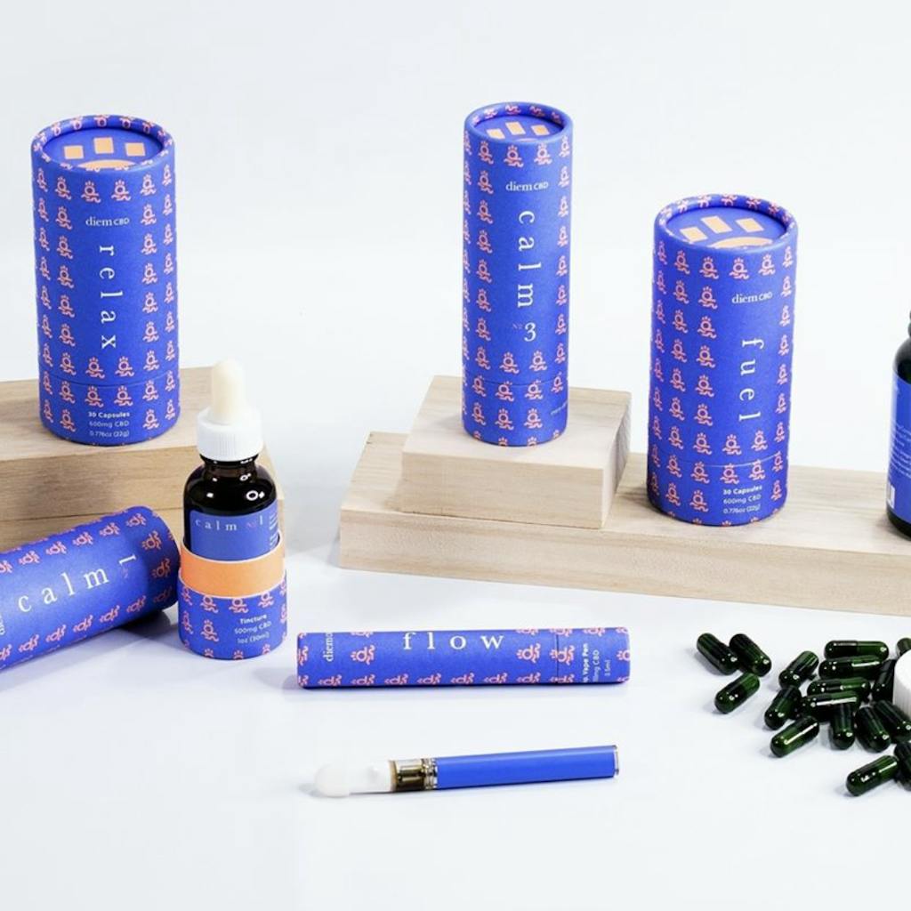
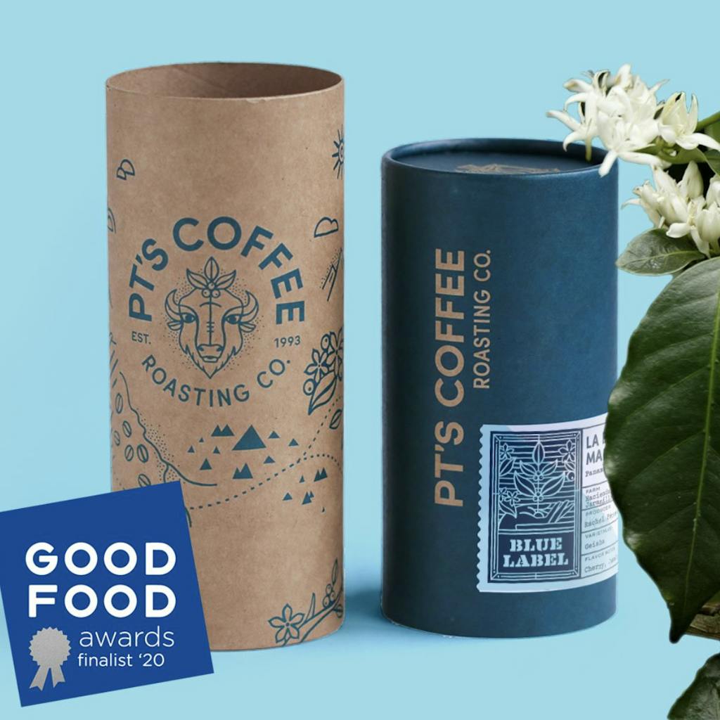
Trends in packaging are changing as more and more consumers seek out brands that align with their personal values. David Molo of The Paper Tube Co., says that a lot of packaging has become more earthy and organic looking, with a craft feel, often made from natural and recyclable materials. Reducing waste in packaging is also on-trend. “Everybody is moving away from plastic—that’s a big thing,” Molo notes, which is a boon for The Paper Tube Co., since their tubes are paper-based. “There is a lot of movement toward minimal packaging, no single-use plastic.”
Packaging that steps outside the box—pun intended!—is also making waves with consumers.
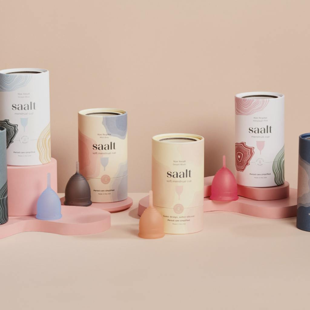
“If there’s one word to describe current trends, it’s ‘bold,’” says Nick Holmes of Antlur Design & Development. And boldness is showing its face through various forms, from geometric shapes, bright or flat colors, and patterns. “Seeing illustrations and illustrative typefaces make a comeback is immensely refreshing since they add a lot of personality to a brand,” Holmes says. It’s a contrast to the ultra-clean aesthetic that was pervasive in the branding world.
Keating is also seeing textured packaging trending. “How your package feels in the customer’s hands can invoke emotions about the product inside,” he explains. “For example, a glossy box with an embossed brand logo is exciting to open because it symbolizes a premium product.” And, he adds, consumers look to packaging as a signal of the quality of the product inside, and it’s your packaging that sets you apart from the competition.
What to avoid when picking packaging
When thinking about packaging design, it’s just as crucial for suppliers to consider what to avoid when it comes to packaging, as what to include. For example, choosing packaging that is dated or no longer on-trend may not appeal to consumers, and, notes Keating, changing your design too much may make your product unrecognizable to loyal customers.
“Don’t economize your packaging. It’s okay to minimize the amount of packaging materials you use and alter the size of the packaging to some extent. But avoid dramatically changing it,” says Keating. He adds that packaging for a particular product that is noticeably smaller may make customers question whether the quality has diminished.
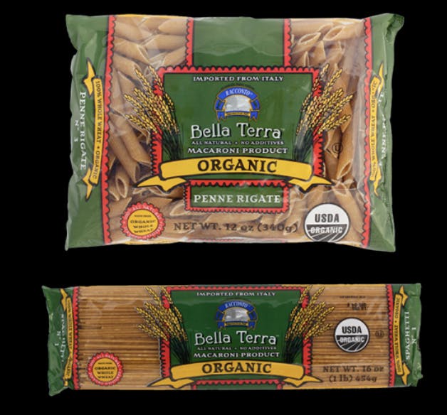
And don’t go with lesser quality packaging just to save a few pennies, Holmes advises. “One of the biggest setbacks I’ve encountered for a product is skimping on the quality of the packaging,” he says. “Five cents per package can certainly add up to a small business, so this is not a recommendation to spend yourself into oblivion, but the potential for better shelf presence and presentation can (and usually does) lead to better sales.” Companies that put extra care into how they present their product typically end up raising both consumer confidence and their own profitability. Holmes notes that in his work with Bella Terra® Organic to redesign their durum wheat and whole wheat pasta packaging, cost was a factor, since the product was being shipped from Italy. Research showed that switching from a lay-down bag to a box would convey a higher quality product and felt more organic. What’s more, he adds, “A stand-up box also has much better shelf presence, so more people would see the product in general. The minimal increase in cost of packaging led to a 27% sales increase over the next year.”


That’s not to say that brands should never change their packaging. In fact, Keating encourages brands to embrace change through using elements that will positively impact the packaging, whether that’s color, materials, or packaging structure.
“Make sure the new packaging does not lack a ‘wow’ factor,” Keating says. “Consider using special printing or updating the brand logo. The key is for the packaging to stand out from the competition in a way that reflects the quality of your brand and the product inside.”
The makings of a packaging winner
Ultimately, creating a winning packaging design comes down to one thing: Your brand.
“It depends on you as a brand, knowing your audience, and designing something that speaks to them,” Molo says. “One design and one look for one brand could be a winning design for all brands in that category. It means that you have to understand who your core audience is, what they react to, and how they differentiate your brand.”
Holmes agrees, noting that a “winning” design could be anything—as long as it’s tailored to the product, “which in turn means tailored to the consumer,” he says. But regardless of the design, all packaging needs clarity, he adds. “You have 3 seconds to capture your intended buyer. Make it count!”
Need product packaging help? Access our complete list of packaging and design experts in RangeMe Services here.


